Summary
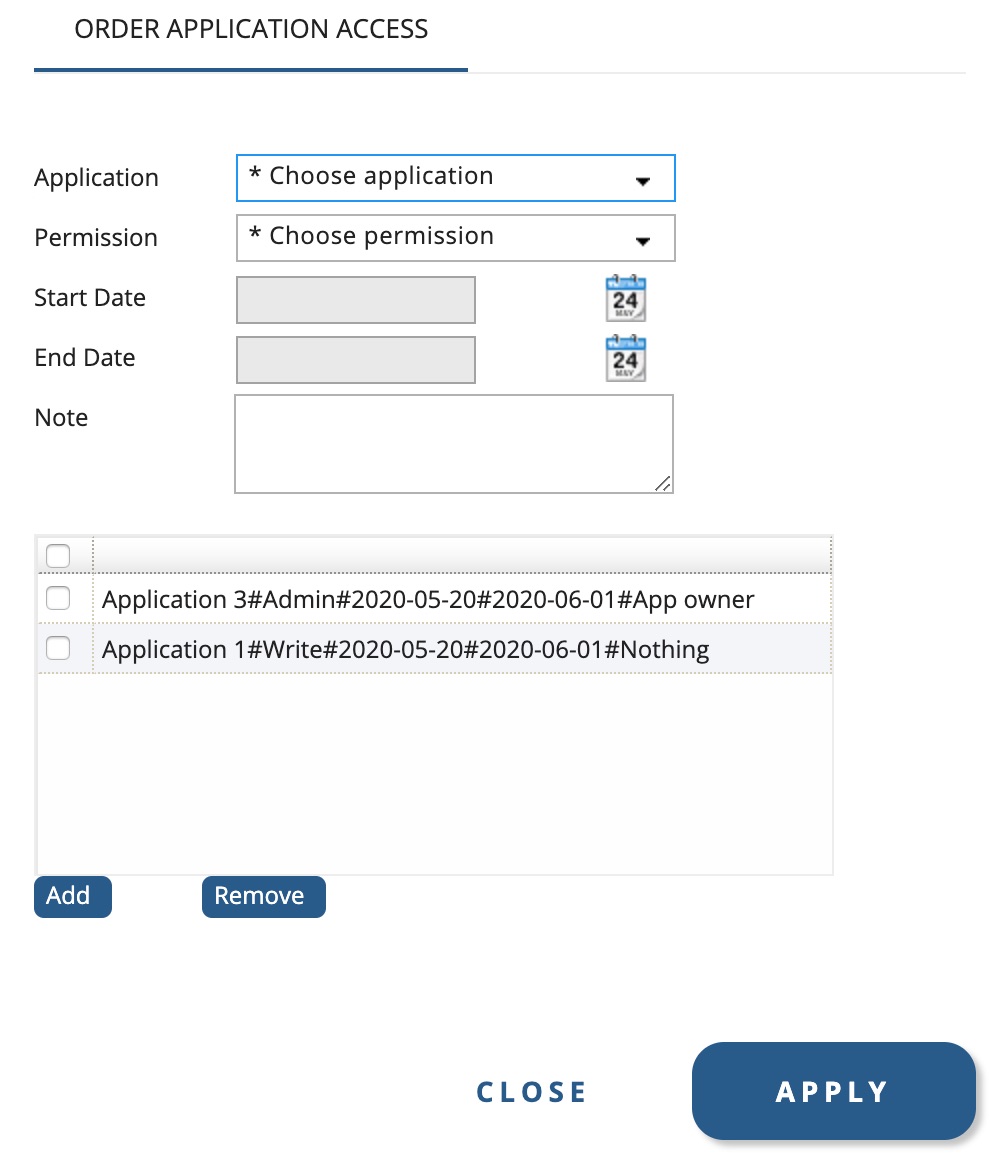
This custom control will concatenate fields from named controls in a customized order and store them as a multivalue list which will be displayed in a grid.
Use case:
Compose a multivalue string to store values from other components in a form.
For example:
You open a user and you like to add applications with some settings for that user. The things you choose in the form will be added to another attribut on the same form. See example screenshot below.

Configure the custom control
1 Download the custom control
The custom control is downloaded here.
2 Add custom control to IM Configurator
Add ConcatenateInGridCustomControl.class to the following file path:
\..\PhenixID\IMConfigurator\ext\class\psd
You must restart IM Configurator for the custom control to be active.
3 Add custom control to IM WEB
Add ConcatenateInGridCustomControl.class to the following file path:
\..\PhenixID\IM\customer\extension\class\psd
Add ConcatenateInGridCustomControl.jsp to the following file path:
\..\PhenixID\IM\customer\extension\web\jsp\psd
You must restart IM WEB for the custom control to be active.
4 Parameters for the custom control
Class name: psd.ConcatenateInGridCustomControl
| Parameter | Description | Example |
| Concatenated value | The configuration of the concatenated value. Use {} around attributes from form that should be inserted in the string. If the value that should be added comes from another custom control (such as “Single Value Select”), the component that contains value to be concatenated might have to be specified. If the value in manager attribute comes from Single Value Select the value has to be fetched like this: {manager:searchFilter}. | displayName, currentDate and department. All values should be separated by a #. {displayName}#{currentDate}#{department} |
| Button position | Where the add and remove from grid buttons should be placed. Possible values are: top, bottom, left and right. Default: botttom | right |
| Button width, in pixels | Leave blank to use preferred width in top/bottom and 60px in left/right. | 80 |
| Label – > Add button | The label of the add button. Default: Add | Append |
| Label – > Remove button | The label of the remove button. Default: Remove | Delete |
| Jsp file to use | If a custom jsp is going to be used. Default: /jsp/psd/ConcatenateInGridCustomControl.jsp | /jsp/customerspecific/ConcatenateInGridCustomControl-new.jsp |
DISCLAIMER
Information provided in this document is for your information only. PhenixID makes no explicit or implied claims to the validity of this information. Any trademarks referenced in this document are the property of their respective owners.The origin of this information may be internal or external to PhenixID. PhenixID makes all reasonable efforts to verify this information.
PhenixID - support.phenixid.se